Thursday, January 31, 2019
It's a New Year of Cards
On release day, I bought my first Topps flagship pack since 2015.
As some of you may recall, I had so many complaints about the annual Topps flagship set that I gave up on it altogether. I was never a set builder, but I used to buy my share of the stuff (hey, it's cheap) as an annual ritual. I quit cold turkey with the hideous 2016 set, and those same issues I had never really went away in subsequent years. However, this year's set has a design that actually appeals to me, with one glaring issue... and it is a very glaring issue. I also heard through others that they righted a great wrong by restoring full stats to the back, after back to back years of getting the '80s Donruss treatment: just the five most recent seasons' worth of stats.
The first card out of the pack was Votto Joey, and yes, I'm going to be reversing the names of these players all season long. Why, Topps, why? I wasn't super excited to see Votto come out of the pack first, but I don't control the universe.
Here's a good look at Bader Harrison and his rookie cup card. Topps is still using very heavily processed and closely cropped photos for their cards, but a solid design (with one glaring exception!) does well to cover that up.
It looks like Topps is paying tribute to each team's stadium with their team cards this year, which is a nice look. I'm one of those guys who is jealous of everyone who made it their life's goal to visit every MLB stadium.
I like that Topps is documenting the team's starting lineup and pitching rotation for the previous season. Are the Team Leaders stats chosen at random, or does every team just have OPS and Saves?
Didi, comin' in hot!
Another close-up of a Cardinal. Again, the last names first thing looks even worse when the last name is significantly longer than the first.
Ah, the backs look really nice, though! This is an especially good looking color scheme for St. Louis, with the Cards bringing back the baby blues this season for the first time since 1984. And, look at all of those stats! We get more than a decade's worth of stats for a guy who bounced around all levels of professional baseball before finally getting his big break.
Here's a slightly overhead forward-facing shot of the Cardinals sudden ace of 2018, Mikolas Miles.
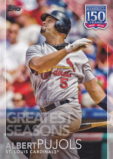
My one an only non-base card was an Albert PUJOLS Greatest Seasons card. One out of thirty-four? That seems a little low to me.
Springer is a guy I semi-sorta stealth collect. His friends call him George.
I bought into a case break, so I probably won't be going nuts on these packs in the future. I am not hating this, though. I do wish they'd finally take a long look at switching up the card stock to make these feel like classic baseball cards again, but I'm not going to hold my breath. I will have plenty of extra Cardinals team sets in the future, if you're a fan of that team.


First I've seen of that Didi. Pretty good picture! Thanks for sharing.
ReplyDeleteSo far the team cards are my favorite thing about this product, but some of the photography is rock solid too. Love that Springer and Votto. Great looking cards.
ReplyDeleteI assume the last name is up on top because someone thought having it below would kinda sorta have it blend into the team name. The solution is to remove the team name...folks buying baseball cards will know the team based on the logo.
ReplyDeleteI have a lot of thoughts that I'm saving until I get my group break haul from Crackin Wax, but I don't like the design. The photography seems pretty good. Congratulations on getting an insert you need out of that massive set.
ReplyDelete