

A heaping helping of Cardinals from the renowned Padres autographs collector!
A few months back, a big fat package landed on my doorstep from fellow Portland resident Padrographs. I have been working on a return package of some sort for quite awhile now, but in the meantime, let's check out a few of the spoils of what I received.

As soon as I heard about the Bob Ross-branded Topps online set, it immediately went to the same place as "Ben Baller" Chrome cards and other vanity projects that the big company has put for sale online over the years. That place is not the want list. That's not going to stop me from begrudgingly collecting these when they can fill some spots in my team collection binders, though, even though the set feels a little bit like grave robbery. The main design reminds me of a GQ retread design, which could certainly be worse, but also could be a lot better.

This one is an insert, but uses similarly "inspired" Bob Ross-style background art. There are some goofy variations in the set, where they make player's hair grow like happy little trees or whatever. In any case, more Jordan Walker is always fine by me, even if they had to hassle the estate of the legendary PBS television painter one more time.

Here's a pair of Cardinals sluggers from the multi-sport 2002 Upper Deck Superstars release. This is one of those oddball sets I discovered long after the fact that it was released, especially when it's not always easy to search for due to how it's categorized.

A horizontal (or landscape as we like to call it) photo is the perfect vessel to show off the weirdness that was last year's Halloween-themed "black and orange" parallel from the Topps Update set. The background is gone in favor of the weird striped pattern that almost evokes Charlie Brown, but not quite.

I believe these thicker cards were part of one of last year's "Super Box" configurations that Topps used for their flagship sets. Confusingly, these were named Flagship cards (Flagship Collection?) despite being wholly separate from the actual base set. Also, several times I erroneously called these "Companion" cards, when in fact those were another thing more closely related to the base set. Got it? Good.

I've never been a fan of camo hats and other wearables in sports because they nearly always clash terribly with the rest of the team's colors, but it's nice to occasionally see one pop up on a card just to document the occasion. In this case, most MLB teams have been wearing stuff like this for Armed Forces Day, which just so happened to fall on May 21st, the day after Nolan Gorman's big league debut. (I believe they wore these caps for the entire weekend series.)

This 1969-inspired insert design from last year's Topps Archives set was a bit of a stretch. They took a team poster design from that year and repurposed it as single-player insert cards, slapping a bit of foil on them for good measure.

Another SI For Kids card has entered my collection. It looks like this one is from around 2007 and features Hall of Famer Scott Rolen.

Padrographs has sent quite a few Portland Beavers cards my way over the years. This is from the 1982 TCMA team set when the Beavs were the Pirates AAA affiliate and still riding high on the We Are Family fumes.

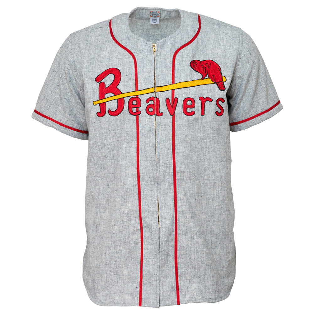
I saved the best for last, however, with a card that fits nicely into both my Beavers and Cardinals collections.

For a short time long before I was around, the Portland Beavers were affiliated with the St. Louis Cardinals, which would still resonate occasionally in their logos and branding well into the '00s, with a beaver replacing the familiar "birds on the bat" design. As you can see from the back of the card, this was from a Union Oil sponsored set (in 1961), and the subject (Ray Katt) was a former Cardinal who had started coaching with the Beavers.
Now I just need to dig up some more Padres autographs.