

What I like and don't like about 2023 Topps.
I preordered a couple of blasters of the new Topps flagship set and they arrived late last week. Overall, it was a fun time, and I can see why we all tend to get excited about this release. It's a near year of cards! I wasn't sure how many things would change with the set as it's the first major release after Fanatics has apparently fully taken control over at Topps. While some uncomfortable changes have been made on the distribution side to apparently cut out a huge portion of box breakers and resellers, the overall product is pretty much the same as it ever was. That can be a good thing and a bad thing.
Like: The base design. Are you surprised? I'm very surprised! Like most people I was listening to, I didn't have a lot of good things to say when the design was first teased. There is a lot going on with these. But having these cards shows me that the design is at least memorable, and it brings in a second inset photo of the player, something we haven't seen on a flagship Topps card in what feels like forever. Some of this, especially the player name and placement, feels like something Panini would have done with one of its Donruss sets if it was handled by a design professional (sorry, Panini.) Overall, though, I will remember these cards, something I can't exactly say about a lot of their white bordered sets from recent years.

Don't like: These manufactured rubber puck patch things. Topps has been all over the place throughout the years with what they offer as their incentive to buy a blaster, but would anyone miss these if they were gone?

Like: This retro-inspired insert set features a large number of retired players. I am not a huge fan of the design per se, but the player selection is fun.
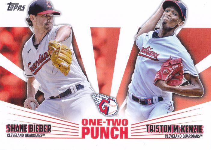
Don't like: These One-Two Punch inserts. These remind me too much of 2010's Legendary Lineage inserts, or even 2011's Dynamic Duos. I've always thought inserts are better suited to feature a single player.

Don't like: Topps gold parallels. Here's my annual complaint about the gold parallels that are numbered to match the year that they were released: they aren't gold anymore! I wish they would bring back the real gold look to these. Is it too expensive to produce these the old way? Did they forget how to do it? The only thing these are really useful for anymore is to give a way for math nuts to extrapolate an estimated print run for the whole series. (It's way, way higher this year than at any point in the past 25 years.)

Don't like: The RC logo. It just feels like it has nowhere to go. It really wants to be where that C position is, but it can't be there.

Like: Full stats for rookies. This is actually something they brought back last year, but I'm glad they're sticking with it. For many years, Topps treated rookie card backs differently in that they only showed the previous season's stat line (and until 2021, only minor league numbers.) When I first get my hands on a new rookie card, especially of a player I'm not familiar with, the first thing I want to is flip the card over and see what the dude is all about. Did he get any big league ABs last year? How long did he spend in the minors? Did he come up through the same organization he's with now? This stuff is all easier to digest when you can actually see the player's stats. Of course, there are great resources for this online, but baseball cards still exist in a world where all of the information is self-contained.

Like: These All Aces inserts. I absolutely love these. They feel like they come from a completely different era of cards. If I wasn't trying to focus my collecting interests on teams lately, I would have to think strongly about collecting all of these.

Don't like: These Stars of MLB inserts. I didn't like them last year and I don't like them this year. At one per pack, they feel as frivolous as those ToppsTown inserts from the early '10s. It also doesn't help that the design just doesn't work for me (what is that font?!) If anything, these work a little better in their Chrome versions.

Like: Farewell cards. Topps gave both Albert Pujols and Yadier Molina a proper sendoff this year. I wasn't surprised by this necessarily, but I wasn't completely sure until the checklist came out.

Like: Full stats! You love to see it. Yadi and Albert also got their card numbers assigned to their famous uniform numbers, which is the ultimate honor from Topps. I still need to track down that Yadi card.