On a day where the Trail Blazers new logo was leaked, here's a look at some old cards.
Nike is taking over the NBA apparel contract starting next season, and with that comes the inevitable changes in uniform designs and logo tweaks. The Blazers haven't done much of anything to their primary logo or uniform in awhile, so it's not surprising that they are next in line for some redesigning. We're all very nervous about the uniforms, but the new logo leaked today and it's not so bad. The pointless silver has been eradicated, with the logo reverting to a cleaned up version of their '90s titled pinwheel look. As much as I'd like them to fully commit to going back to their original logo and look, I guess you can't have a "throwback" design if you have nothing to throw back to.
KO Rob sent over a bunch of old school (and middle school?) Blazers cards recently, so I thought this would be a good time to show some of them off. I must say, the player name font is really strange on these 1996-97 Stadium Club cards, but any Sheed card is a good Sheed card.
The Blazers actually wore red on the road as a primary jersey for a time, before they switched back to black permanently in the late '80s (and before secondary/alternate jerseys were even a twinkle in David Stern's eye.)
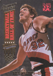
This is the look that everyone gets misty-eyed about, which Portland wore from 1978-1990 if memory serves me. I had no idea about this Action Packed set from 1993, but this is a great looking photo of Walton.
Of course, when the Blazers won their championship, it was the one season (only season? I think?) where they wore the team name spelled out vertically down their jerseys. It's not a common look. But when you see it, you remember the championship team. (Well, I don't technically remember it, exactly. I was 1 1/2 years old when they paraded down the streets of downtown Portland.)
Rob also sent a nice stack of oversized cards, including this NBA Jam Session Terry Porter card. These are like the GameDay equivalent of NFL cards, or like Fleer's Extra Bases in baseball. The mid-90s were crazy.
In the same dimensions but decades earlier was this set from the experimental Topps days. I've featured a number of cards from the 1970-71 set on this blog, which feature a lot of weird looking would be Blazers in random attire in their expansion season. Yes, this is the set with the Pat Riley rookie card, believe it or not.


Here's a question I've had for a while that you can probably answer: what does Rip City mean?
ReplyDelete"Rip City" is basically just a catchphrase invented by the team's much beloved original radio play by play voice Bill Schonely. He started with the team during their expansion year and is still involved with the franchise today at 87 years of age. If you don't know much about the Schonz, you may at least be familiar with his voice as he did a lot of voiceover work nationally for the NBA (the "It's Fantastic" campaign of the late 80s/early 90s for example).
ReplyDeleteCool, thank you! I've been wondering about it since it first showed up on their alternate jerseys.
ReplyDeleteI finally came across some newer Blazers for you, but since we're getting ready to move, all my card stuff has been packed up. I'll get it mailed out to you sooner or later! And IMHO, any card of Walton at his beardiest is a good one!
ReplyDelete