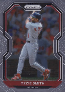
Panini Prizm's Baseball offering is colorful fun without logos.
Panini's MLB sets always come with two strikes against them. The lack of MLB license (no logos) is the most obvious thing, but there's always been the mentality that Topps, with their uninterrupted run at baseball cards since 1952 (ish), is the one true brand to collect. That mentality is about to tested in the Fanatics era, of course. It will be interesting to see how history looks back at baseball cards from other brands that aren't Topps once Topps stops making cards (unless, of course, Topps is purchased and does the overlord's bidding.)
In any case, I like Prizm baseball. It's come a long way from the 2012 set (actually released in 2013.) The early Prizm sets are seriously ugly, even the ones where Panini held a proper license. I bought into a couple of breaks over at Rip City Cards for a reasonable price and feel like I did pretty well for myself. Let's check out some of the goods.
Much like the third-class citizen that it's treated like, the baseball version of Prizm always gets a leftover design. This is the same design as last year's NFL and NBA sets. In some other brands where designs are shared across sports, baseball leads the way, but that's not the case with Prizm.
I'm happy with any set that continues to casually toss in an Ozzie Smith base card in 2021. Someone at Panini loves The Wizard, because he's in a ton of their sets.
Prizm tries a little harder with their inserts than, say, Topps Chrome. I know that it's not completely fair to compare Topps Chrome to Panini Prizm, because Donruss Optic is a closer analogy as long as you consider Donruss to be Panini's flagship baseball set. (Is it?)
Here's the classic non-MLB license player photo. There isn't really a logo to hide here.
Here's Paul Goldschmidt, star player of the 46ers.
Okay, that's just weird.
I did pretty well with the colorful parallels in these breaks. This is a snaky snakeskin parallel of the Cardinals rookie, numbered to just 50. I pulled a rookie year Zac Gallen snakeskin parallel from last year's Prizm set which I think I might have hung on to. Gallen was a Cardinals draft pick originally that was dealt to the Diamondbacks, making his snakeskin version much more appropriate.
Here's a basic blue parallel, Flaherty syle.
And here's a red one. I don't really know the rhyme or reason or distribution odds for most of the Prizm parallels, except that they are numerous and attract only a certain type of collector. I don't think I have it in me, personally, to chase a "rainbow" of any particular card (...or do I?)
This KK "blue mojo" parallel has the same look as the Bowman "megabox" exclusive parallels that people also call "mojo". Who decided this was to be called "mojo" and who came up with this pattern first?
This is another rookie year numbered parallel. Woodford is at least temporarily in the Cards rotation again and has a big start ahead of him against the Mets tomorrow. He can do it! I believe in him.


Blue Borders always seem to go best with Prizm (Chrome).
ReplyDeleteSnakeskin is a pretty cool parallel.
ReplyDeletePanini can never get the image right; sometimes you can't notice the missing logos and other times it's just so obvious. They can do shiny, though.
ReplyDeleteI bet that Ozzie would look great in red.
ReplyDelete