
A #CrackinWaxMailDay from @CrackinWax features the late-arriving Topps Archives set.
For the past decade, the Topps Archives set has been a summertime event, adding some much-needed fun and nostalgia to an otherwise stuffy release schedule. It's a breezy set. It's not essential and not quite low-end, but it's affordable enough that almost anyone could collect it. I usually pick up a blaster or two, collect the team set and then mostly forget about it. In recent years, they've really packed in the nostalgia by adding classic movie tie-ins, an Expos feature, and metal discs that resemble the late '80s (and '60s before them) baseball "coins". This year there was really nothing on that grand of a scale that was added, and the set arrived very late in the release schedule due to the ongoing issues at Topps in their last days as a viable baseball card company.
It's new cards, so I must have them (for some reason.) I once again went to Crackin' Wax to fill my "new cards" need in a case break. I have a few extra team sets if anyone is looking for one.
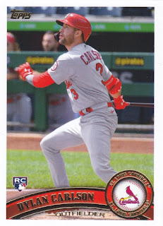
To be fair, this year's set is still fun, if a little late. The 2011 design gets a nod here, and it looks nearly identical aside from the gold foil replacing the usual silver. I understand that changing the foil color is a good practice for distinguishing reprints from the original thing, but it seemed unnecessary here as none of these cards are actually reprinted from the 2011 set.
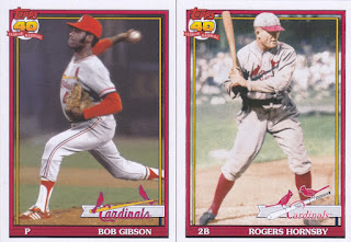
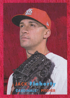
Next up is the 1957 design, last seen in 2015 Topps Archives.
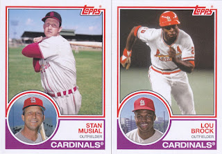
And then there's the 1983 design, which... same. This is Topps shrugging and saying "you bought it six year ago, so why not?"
The 1991 design was used even more recently as part of the 2016 Topps Archives set. They just wanted to re-use this design so they could slap the new "70 Years" logo on some of these and call them variations.
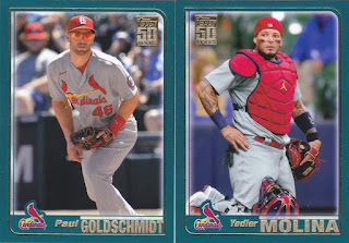
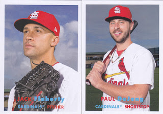
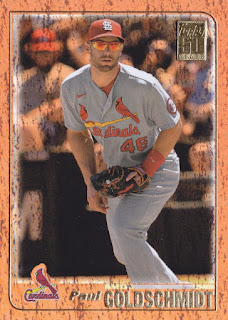
The same goes for the 2001 set, except that I don't believe this design has ever been re-used outside of possibly whatever Topps does with some of their on-demand throwback products. This was a welcome sight.
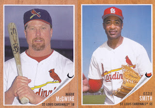
I don't think Archives (in its current form) has used the classic woodgrain 1962 Topps design before. In the early '00s, a number of cards used this design, but those were actually in the style of reprints, which was the original "Archives" concept.
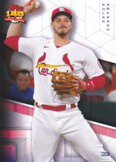
The less said about the "70 years into the future" design, the better. The amusing thing about this to me is that it was conceived long before Topps lost their MLB license, making Topps producing baseball cards in the year 2091 even less likely than it already would have been in the first place. I'd like to add that all of my Arenado cards were damaged in the same spot. I'm guessing there was some sort of issue with the sheet that these were printed on.
Inserts are fun, though! These "movie posters" inserts also have a box topper counterpart that is an actual mini-poster that you can unfold and stick on your wall. This one is just a normal card-shaped card, however.
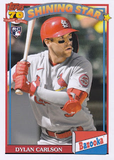
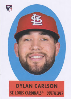
Topps also went back to 1991 to honor their Bazooka set, which used a similar design as their flagship set.
I also landed a few numbered parallels in this break. This orange something or other Paul Goldschmidt card is numbered to just 15!
Jack Flaherty gets the red something or other parallel treatment with a card numbered 30 out of 50.
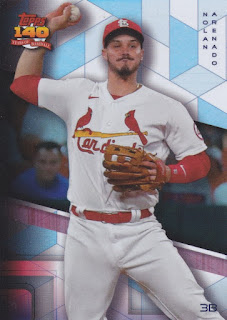
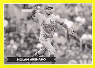
A more basic parallel came in the form of this Nolan Arenado, which basically looks like a holofoil card.
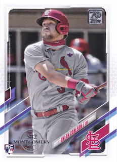
That's all of the Archives that I received. As a huge, huge bonus, however, CW threw in a whole team set of this 582 Montgomery Club exclusive foil-stamped factory set. Very nice! I won't subject you to another 21 pictures of flagship base cards with a stamp on them, however.
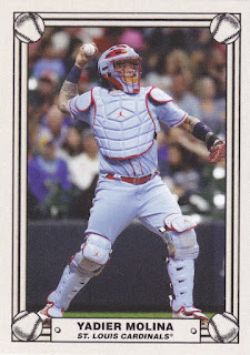
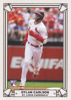
It turns out that even the bonuses have their own bonuses, because I also ended up with three cards featuring old supposedly lost designs that were part of a small set that was also exclusive to 582 Montgomery Club members.
This design looks fantastic in my opinion. I wouldn't mind seeing this get a wider release with a bigger set.
I'm not sure about this one, however. Was Topps really considering putting out a bright yellow bordered set in the black & white photo era? This seems more like it may have been a Bowman thing, although again I'm not sure I'm buying the yellow here.
Thanks again to Crackin' Wax for the extra goodies!
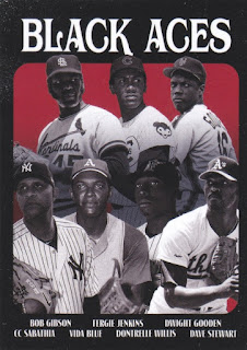
I like the Black Aces card.
ReplyDeleteAnd how Bazooka makes it clear their Carlson card is a Bazooka card. Weird how often food brands don't do that.
I love the Bazooka cards!
ReplyDeleteWhy isn't Mudcat Grant on the Black Aces card? He's the guy who really pushed that concept.
ReplyDeleteThe Black Aces card has a "One of these things is not like the others" vibe to it. :)
ReplyDelete