

A big ol' case break of Allen & Ginter from @CrackinWax brings us the latest #CrackinWaxMailDay like it's summer in November.
If it felt strange to be getting my first look at Allen & Ginter around the late November holiday season, last year's blog post confirmed it: this set is very late. With everything continuing to be delayed, it made me wonder if this was just a repeat of last year's late arrival, but an August release wasn't nearly as far off from the norm as this year's schedule. After doing a bit of waffling, I did finally get into a case break from Crackin' Wax for this year's version. Like last year, I think it's just alright. I don't love it, but it is distinctly Ginter.

The design seems like it was some concept art for the pack design that crept its way into the card border itself. It leaves less space than ever for the player photos.

An 'RC' logo is always going to look funny on vintage-inspired sets, but I do prefer the standard logo to times when they've tried to make it blend in with the design and color it all sepia-toned or gold or something.

The way the border just fades away into nothingness on the right is surely going to drive the people who freak out about card centering up the wall just a bit.

Tim McCarver made the short list of SP subjects, which is a nice switch from the usual group of HOFers (and McGwires) the Cardinals typically end up with.

Minis, as you'd suspect, look very similar. They're smaller! There's even less room for the photo. I do really miss the first few sets (2006 through 2008) that would use much smaller photos, because they made the minis look a lot nicer.

Black minis are also small and, you know, black. I actually think this is one of the best black mini designs (giant logo aside) as they tend to switch these up from year to year.

Here's another black mini featuring the new NL MVP. Congrats, Goldy!

As usual, there are some full-sized inserts featuring various baseball players. This set is a bit on the boring side. It would be nice if the front featured something about the season besides the year in huge letters.
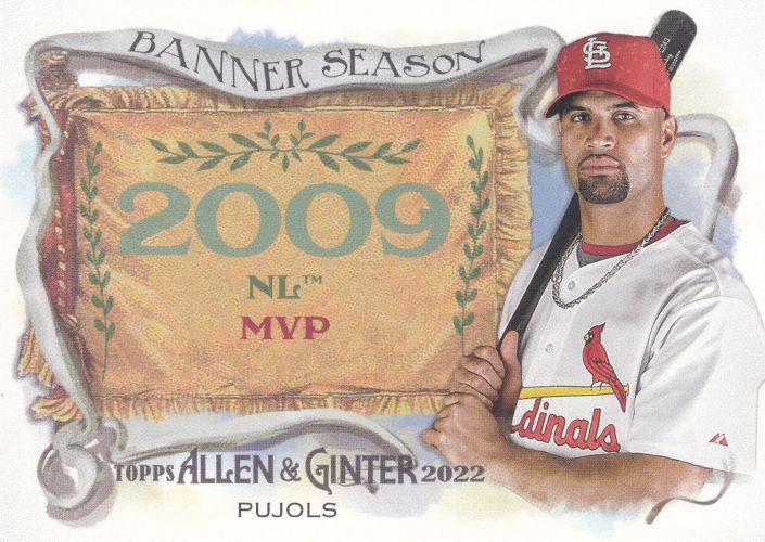
There are "final year" Pujols cards in the set, but this one is a throwback to his initial Cardinals run. I sure do miss the old Majestic jerseys.

This one is for the pitchers, and Gibby makes an appearance again. They did a clever thing with the background on these, I guess.

I landed two "hits" in the break. This was easily my favorite. Topps can do their Ginter thing year after year, but the mini framed cards always look awesome. Plus, it's Noot! Nooooooooot!

Of course, I much preferred the framed mini relics to the full-sized things, but I'm guessing these are a lot cheaper to produce. I certainly can't complain about adding another special card of the MVP.
What does everyone think about this year's Ginter set? I should probably get some duck cards, huh.
I do like the black minis this year. Otherwise, it's another A&G set similar to the last three or four. The different retired players in the checklist at least have me intrigued.
ReplyDeleteIf the year wasn't printed on the front, I'd never be able their designs apart. They all just kind of look the same to me. I do like that Tim McCarver though, it's a good photo.
ReplyDeleteSeems to be too much border this year, but I'm not big into A&G. McCarver is a nice surprise.
ReplyDelete